vrijdag 16 januari 2015

Cooking with Celebrities: their kitchens – 1

Cooking with Celebrities: their kitchens – 1

As you know we love to snoop into interiors of the famous and the important especially if it comes to cooking in there custom made kitchen.

In all the TV shows we hear how well they cook but I guess most of us will never know. On the other hand we are grateful that we can take a quick look into their interior. We are always wondering if the way the celebrities are dressing are also expressed into their daily lives, interiors and cooking. Looking through the photos one cannot escape the notion that somehow there is a connection. For fun we are including some celebrity photos taken in the year that refers to the kitchen and the interior photo.

Furthermore we truly believe that Sir Elton John should not have any problems to “FURNISH” his home. Just a small joke for the insider.

cher
Asian and Middle Eastern influences inform the interiors Martyn Lawrence Bullard conceived for Cher’s Los Angeles duplex. Although the singer and actress insisted on a neutral palette, the designer used intricate detailing and bold accent pieces to enliven the home. In the open kitchen, hand-carved screens cover the cabinets and conceal state-of-the-art appliances, while Chinese hanging lanterns add to the exotic atmosphere. (July 2010)


DIANE KEATON
Diane Keaton is a pro at restoring old California houses, including this 1920s Spanish Colonial Revival home in Bel Air that designer Stephen Shadley helped bring back to life. The pair reconfigured the interior, transforming three small, oddball rooms into a spacious kitchen and family room. An adapted Robert Frost quote frames the arch above the bar, which is covered in colorful tiles the actress found at a swap meet (April 2005)


ELLEN DEGENERES AND PORTIA DE ROSSI

The kitchen of Ellen DeGeneres and Portia de Rossi’s Beverly Hills home has an artisanal, Arts and Craft–like design aesthetic, thanks in part to the custom-made hanging glass display case that serves as storage for tableware. The stainless-steel range is by Wolf, and the green tile backsplash and painted cabinetry offset the neutral tones of the barstools and antique rugs. The rustic floor is crafted of reclaimed teak beams. (November 2011)


SIR ELTON JOHN AND DAVID FURNISH

Vibrant color and bold statement pieces define Sir Elton John and David Furnish’s Los Angeles apartment, decorated by Martyn Lawrence Bullard. “Hermès-handbag Kelly-green walls,” as the designer put it, lead to the clean-lined contemporary kitchen, which features white Poliform cabinetry. The circa-1969 crystal chandelier above the island formerly hung over the concierge desk at the Grand Hotel in Milan. (December 2009)


GERARD BUTLER

With its mottled walls, weathered surfaces, and crystal chandelier, Gerard Butler’s kitchen looks at first glance like it belongs in a medieval castle—until you notice the modern appliances. The actor described his loft, located in a converted manufacturing warehouse in New York’s Chelsea neighborhood, as a “bohemian old-world rustic château with a taste of baroque.” The kitchen’s cabinetry and backsplash were fashioned from leftover flooring materials. (May 2010)


LANCE ARMSTRONG

“Other than some bikes in the garage, you wouldn’t know who lives here,” professional cyclist Lance Armstrong said of his Spanish Colonial–style house in Austin, Texas, which was decorated by his “partner-in-design-crime since 1995,” Roy W. Materanek. Framed family photographs perched atop the millwork create a striking frieze. The kitchen’s glass door and large windows maximize views of the terrace and garden; the range and microwave are by Viking, and the sinks are by Kohler. (July 2008)


STING AND TRUDIE STYLER

Sting and Trudie Styler tapped architect Lee F. Mindel, of Shelton, Mindel & Associates, to completely overhaul their early-18th-century townhouse in the heart of London. The ground floor, which houses the kitchen, dining area, and family room, was extensively excavated in order to lower the floor and increase the ceiling height from seven to nine feet. For the streamlined kitchen, the ceiling “was punched up to provide space for light fixtures,” Mindel explained. The straw Tom Dixon chair and wide-plank wood floors lend organic elements. (May 2010)


WILL AND JADA PINKETT SMITH

In keeping with the rest of their Los Angeles–area home’s eclectic design scheme, Will and Jada Pinkett Smith’s kitchen features reclaimed ceiling beams, cabinetry fashioned from 19th-century Nuristani oak panels, and adobelike walls. As Will Smith told AD, “Everything needed to be done by hand.” (September 2011)


We hope this has brought some inspiration in your kitchen design. We love the kitchen of Ellen and Portia and we feel like in the summer looking at the kitchen of Diane.

Oock ( www.oock.nl ) , interior designer also designs custom made kitchens for the expat community in Amsterdam and Den Haag, The Netherlands. Let us know your feedback.

Till soon,


Marta

donderdag 15 januari 2015

Keuken op maat - nostalgie, landelijk en klassiek

Keuken op maat

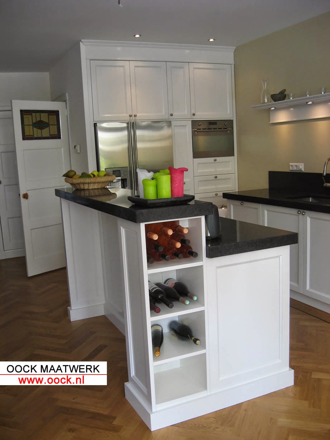
Keuken op maat laten maken? Hier een kort overzicht in 20 mooie foto’s van de door ons ( www.oock.nl )  gemaakte en ontworpen landelijke keukens. Noem het een overzicht van onze all time favorites. Ondanks alle trends blijft de meest tijdloze keuken de klassieke witte keuken. Een klassieke landelijke keuken kan ook altijd wat strakker worden ontworpen zonder zijn uitstraling te verliezen.

Deze keukens hebben altijd een huiselijke uitstraling met een warme sfeer en deze keukens zijn eigenlijk bijpassend bij alle stijlen. Vaak vallen moderne keukens  een beetje weg als zijnde een ingebouwde wand. Het uitgangspunt bij de klassieke keuken is dat je laat zien dat er een keuken staat en dat er in geleefd en gekookt wordt. De klassieke maatwerk keuken als basis en uitgangspunt van het hele huis.

Wat is er leuker dan voor het diner te borrelen in de woonkeuken en om daar te eindigen na een grandioze avond.

Elementen van de maatwerk keukens in landelijke stijl welke wij belangrijk vinden zijn de volgende:

Keuze van de panelen, hiermee stuur je de strakheid van de keuken.

Indeling van het keukeneiland, wel of niet spoelen of koken in het keukeneiland.

Type granieten keukenblad.Vaak zwart maar een blad in kleur geeft een verrassende uitstraling van de maatwerk landelijke keuken.

De vloer, een terrazzo vloer, castello tegels of gewoon hout, allemaal bijpassend maar steeds een net andere uitstraling.

Symmetrie van de keuken. De keuken hoeft niet altijd perfect symmetrisch, wij werken in de ontwerpen graag met focuspunten.

De vrijstaande oven: hier vinden we vaak Falcon of Boretti in de maatwerk keuken.

Handgeschilderd of gespoten, elke versie geeft een andere uitstraling. Spuit je keuken dan houdt je het wat strakker. Verf je de keuken dan creeer je wat meer warmte in de huis.

De schouw: een mooie landelijke schouw met houten profiel of juist een strakke MDF kap geschilderd in een muurverf.

Met al deze elementen kunnen wij de stijl bijstellen en uitbalanceren en tegenwicht geven aan andere elementen in huis. Een keuken op maat laten maken en ontwerpen is leuk!


Kom eens langs of mail ons om over UW keukenideeen te praten! www.oock.nl


woensdag 14 januari 2015

Trends in custom made bookcases

Trends in custom made bookcases

Happy new year for 2015! After not placing blogs for a while we are back with fresh intentions for 2015. We hope you spend a lot of time in and on your interior. This is your domain and you should feel good here.

To refresh the memories we start this year with a small blog on our most favourite product: custom made bookcases and libraries. This is the crown jewel in the interior!
What are the latest trends and developments? 

Classic custom made bookcases and libraries

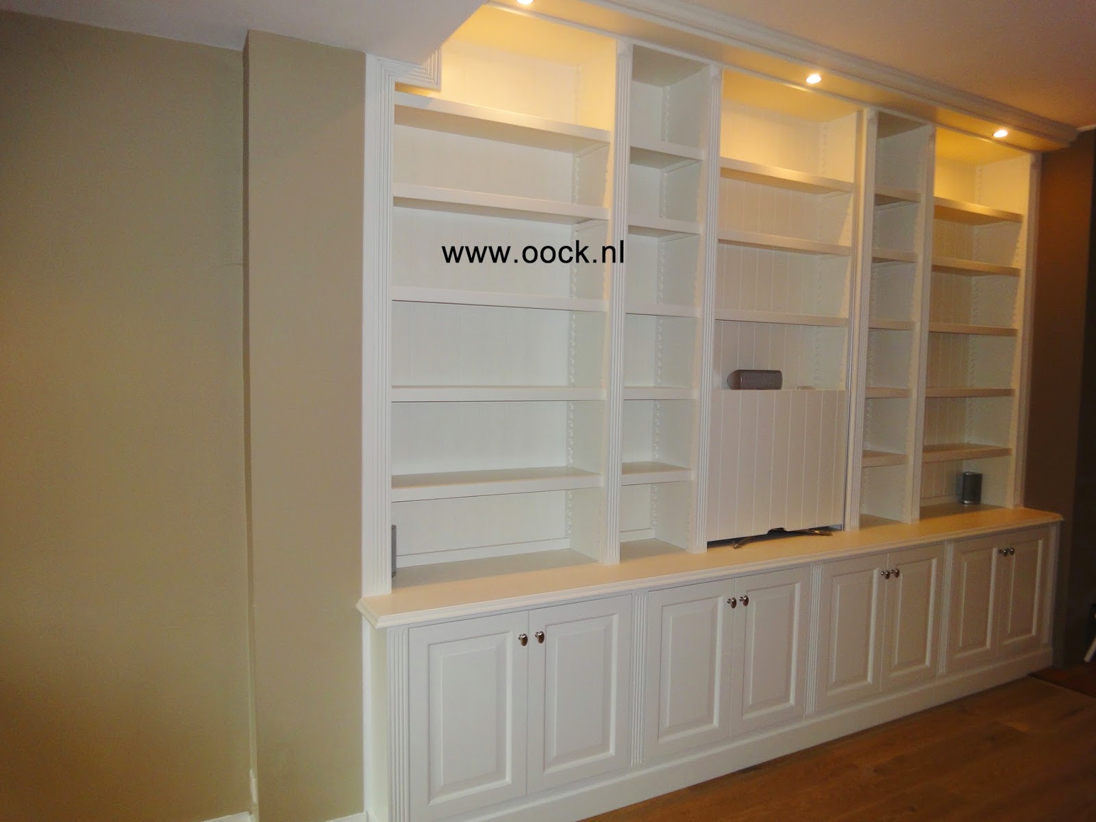
To be honest we have to agree that the classic models in custom sized bookcases are still very popular. Those bookshelves always fit in with classic houses and classic interiors and they give a warm feeling to your classic house and interior. A trend in classic bookcases is to integrate the TV through special lift or sliding systems into the bookcase. We see another trend in the finishing and the colors of the classic bookcases. More often we finish the bookshelves in a mat chalk paint. Examples are Farrow and Ball and Painting the Past. Furthermore we see more challenging colors and color combinations. For example we often use classic green for bookcases or we paint the backwall in a sharp color as was very common in the middle ages and later. For example red, green, pink and orange were used as background for the backwall in more classical and traditional models.

Another trend is to really 100% combine the elements of the bookcase with the classic interior. This means that all door profiles, crown lists and plinths are exactly copied from the house and integrated in the bookcase. Sometimes we combine a fully sprayed or painted bookcase with a wooden ladder. This gives a fun twist to the design. Besides we always play with the divisions of the bookcases, smaller and wider parts are combined and integrated as well as doors and drawer blocks. It makes the cupboard or bookcase less strict in the outlook. 

Examples are also to be seen on our website: www.oock.nl

Did you know that we serve a lot of expat clients here in Amsterdam and Den Haag with our custom made kitchens, furniture cabinets and interior design?


Modern Bookcases: trends

Before the modern bookcases were often a strictly and equally divided and white colored. Still we design this types of bookcases but in the modern designs there are a lot of trends going on. Often we are combining a lot of different elements in the modern design of the bookcase:

Colorish and playful designs

A real trend is to divide the bookshelves in unequal parts to create differently (shaped) elements in the bookcase. Those parts can get a different color, can be closed (or open other way around) in a fully open bookcase or we make those parts in a different material like natural wood. A combination of those elements give a surprisingly playfull effect to you custom made designed bookshelves and includes natural elements like nut-wood. This is important because a totally white bookcase can come across a bit clinical.

Within this design it is important to vary in the sizes of the different parts and to use different thicknesses of the shelves and dividers. In this way we create horizontal and vertical parts in the bookcases. Of course those elements we can also integrate in the white modern bookcase. Do not forget that the books will give a lot of color to the bookshelves.

Focus on horizontal parts and continuous lines in the bookcase.

Another trend is the use of shapes. There are totally out of the box designs but we lately focus on the horizontal lining. For example in one of the pictures we have made thicker horizontal parts in the bookcase. The effect is that from a viewpoint in the room you can imagine just shelving on the wall instead of a real bookcase. The idea behind this effect is that there is less focus on the bookcase of cupboard but there is more focus on the shelves as just a support for the books. Of course in this models you can also integrate bottom doors like you see on the pictures. We always encourage our readers and clients to take a look yourselves or give us feedback. Your can always contact us via www.oock.nl .  


vrijdag 9 januari 2015

Trends in maatwerk boekenkasten!

Trends in maatwerk boekenkasten!

Na een tijdje geen blog te hebben gepost gaan we dit jaar fris van start met de interieurblog! We wensen iedereen het beste voor 2015 en we hopen dat u veel tijd steekt in uw interieur. Dit is tenslotte uw domein waarin u zich het beste voelt.

Om de blog op te frissen beginnen we dit jaar met een kleine presentatie van de laatste modellen en trends in de boekenkasten en boekenwanden op maat. Toch de kroonjuweel van onze producten en van uw huis.

Wat zijn de laatste ontwikkelingen in onze collectie?

Klassieke maatwerk boekenkasten

Gezegd moet worden dat de klassieke maatwerk boekenkast nog steeds in trek is. Deze boekenwanden passen namelijk goed in oudere en klassiekere huizen en zijn vaak een mooie warme aanvulling in de klassieke interieurs. 

Wat dan wel een trend is is om bijvoorbeeld de kast ook te gebruiken als TV meubel met deurtjes voor de TV of met speciale schuif en of liftsystemen. Een andere trend zien we in de kleuren en afwerking van de klassieke maatwerk boekenkast. Vaker werken we de kast af in matte krijtverf van bijvoorbeeld Painting the Past of Farrow & Ball. Verder worden vaker gewaagde en klassieke kleurcombinaties gemaakt bijvoorbeeld in groen of een felle kleur voor de achterwand. In het verleden werden deze kleuren ook vaak toegepast. 

Een andere trend is om de kast echt helemaal klassiek bijpassend bij het huis te maken waarbij de houtelementen exact gelijkend zijn. Verder worden kleur en houtstructuur gecombineerd: als voorbeeld hieronder een houten ladder bij een gekleurde kast en wordt gespeeld met de indeling van de kast. Zo worden brede en smalle delen gecombineerd en worden bijvoorbeel lades geintegreerd. Het effect is een speelser effect. Hieronder een aantal voorbeelden, overigens ook te zien op www.oock.nl :

Maatwerk boekenkast met klassieke elementen

Boekenkast in kleur met houten ladder

Maatwerk boekenkast met TV schuifsysteem: TV kast

Boekenkast op maat in Painting the Past met TV systeem

Boekenkast op maat met speelse indeling in kleur


Moderne boekenkasten: trends

Voorheen waren de moderne boekenkasten vaak een strakke uitvoering met gelijk verdeelde vakken in een dekkende vaak witte kleur. Nog steeds een veelvoorkomende boekenkast maar in de moderne varianten zijn wel een aantal ontwikkelingen gaande. Vaak worden een aantal elementen gecombineerd en geintegreerd in de maatwerk boekenkast.

Speelse en kleurrijke moderne boekenkasten

Een echte trend is om de open delen te voorzien van afwijkende vakken. Deze vakken kunnen een andere kleur krijgen of afgesloten worden in een verder open kast (of andersom). Deze delen kunnen in andere materialen worden gemaakt zoals bijvoorbeeld notenhout in een verder dekkend kleurende boekenkast. Het kan ook dat juist deze delen (afgesloten of open) simpelweg een andere kleur krijgen. Een combinatie van deze elementen geeft zeer verrassende effecten in de leefomgeving en houdt de kast speels met een knipoog naar de natuurlijke materialen. 

Belangrijk omdat een dekkende of geheel witte kast wat klinisch kan overkomen. Een anderbelangrijk element voor deze boekenkasten is het varieren in de afmetingen van de vakken en het gebruik van verschillende diktes van de stijlen en legplanken. Zo worden zowel horizontale en verticale delen gecreeerd in de maatwerk boekenkast. De speelse elementen voeren we trouwens ook uit in geheel witte kasten. Vergeet namelijk niet dat de boeken veel kleur geven aan de kast.

Boekenkast modern met speelse elementen en kleur

Boekenkast modern inspiratie

Boekenkast op maat met hout en kleur

Maatwerk boekenkast met TV systeem en veel kleur

Boekenkast combinatie hout kleur en verschillende type vakken

Moderne witte boekenkast met speelse indeling


Focus op horizontale delen en doorlopende lijnen voor de moderne  boekenkast

Een andere trend is de focus op de lijnen in de kast en dan vaker op de horizontale uitlijning. Uiteraard kan de verdeling weer speels zijn maar de focus ligt bij brede en dikkere horizontale dragers. Het effect is als het ware dat er slechts legplanken aan de muur zijn gemonteerd en dan eventueel in de vorm van een moderne boekenkast. Het idee is dat de nadruk minder op de kast zelf is maar meer op de dragers en daarop geplaatste boeken. Uiteraard kan het ook in combinatie met dichte deurtjes onderin zoals duidelijk te zien op de foto’s. Uiteraard nodigen wij u uit om dit alles te bekijken en te bespreken. U kunt altijd vrijblijvend contact opnemen met www.oock.nl

Boekenwand met horizontale focus

Strakke boekenkast met dikkere legplanken

Boekenkasten op maat